
Grounded, We Radiate.
At Valpo, we project the image of goodness in which we are created, bringing truth to light, leading our communities in service of others, and finding our inner joy in reaching out. Our brand platform is designed to share that story, to show how being anchored in these aims allows us to shine brightly – for all.
Strategy
In a crowded marketplace clamoring for attention, it’s more important than ever that we know how to tell our story well. To do so requires a strategy. After extensive research, countless hours of interviews with students, alumni, faculty, staff, and community members, and scouring the archives, we have identified the key elements that lie at our core, the very beliefs and values that shape our brand identity, who Valpo has always been. Informed by this identity, our strategy incorporates five components: audience, essence, positioning, message, and personality. Through these components, our story becomes elevated and recognizably ours, illuminating our mission and core values in all of our communications and allowing for effective and authentic connections.
Voice and Tone
It’s not just about what you say, it’s about how you say it. And when it comes to voice and tone, the who often determines the how. As we shape our messages to embody Valpo’s unique personality, we allow our words to reflect our inquisitive, ethical, humble, compassionate, faithful, and active qualities, humanizing our brand and creating stronger, more lasting emotional resonance.
Logos
When our community sees our logos, they think Valpo. It’s the signature of our brand. Our goal is to unite our campus under one cohesive look – from primary signatures to text-based co-brands to distinctly athletics logos – with purposeful, reflective color schemes and applications that resonate with our Beacons and the wider community.
Our Visual Identity
Our visual identity refers to the collection of visual elements that represent and differentiate Valpo as a brand. In many ways, design serves as our silent brand ambassador, reinforcing our core values and brand promise through visual mediums. As we establish a clear, bright, and consistent visual identity, we build a belief in Valpo’s promise that the light from God that shines through us all is true and for everyone.
Typography
Our typography is designed to reflect Valpo as a whole: a harmonious blend of traditional and modern aesthetics. Our goal is to evoke a sense of heritage and fresh, forward-thinking energy through subtle design elements and classic letterforms. This guide contains a breakdown of Valpo’s approved fonts and typesettings, complete with downloadable links, typesetting examples, and usage and placement requirements.

Color
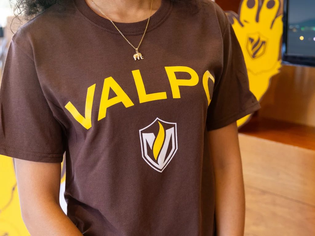
Valpo, as we know it, is bold and distinctive – with purposeful color palettes to match. Leading with Valpo’s heritage brown and gold, our palettes are designed to deepen content layouts and maximize readability. Referring to our sample color combinations and accessibility matrix, we’ve established a modern look that draws directly from our roots resonating with all – from prospective Beacons to alumni to supporters from all over.
Use this guide to browse our color palettes, view how best to combine our primary and secondary colors, and discover which color schemes will best suit your project goals.
Photography
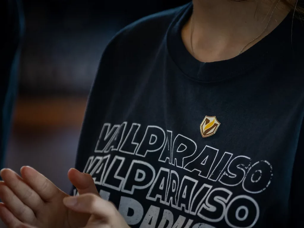
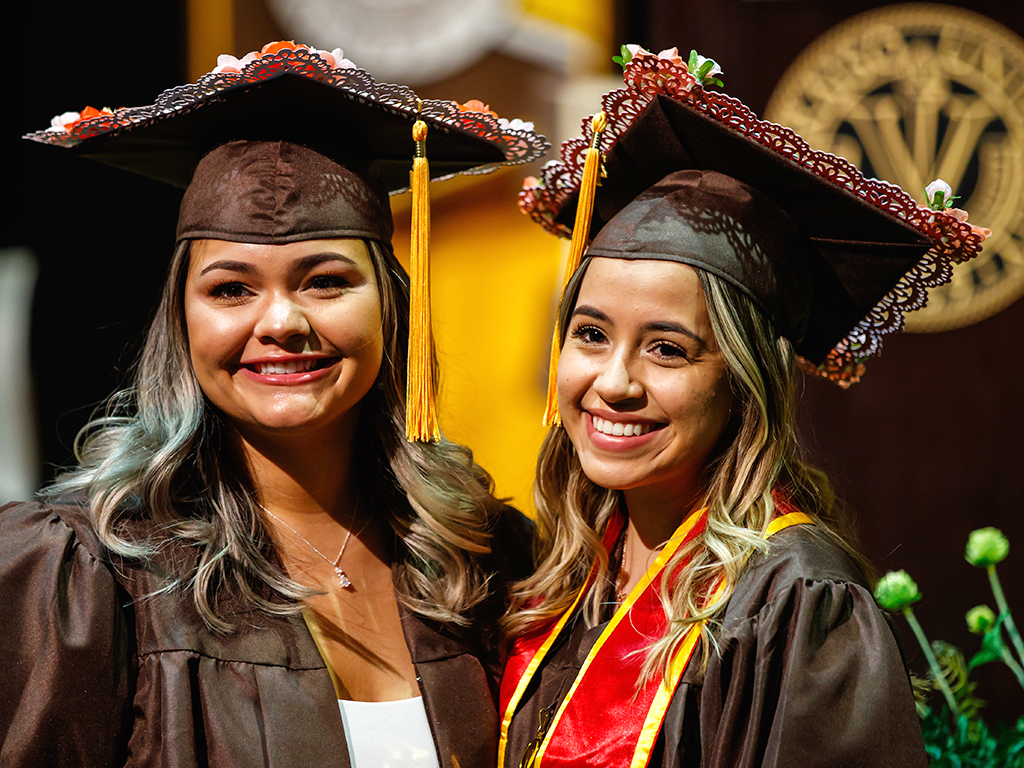
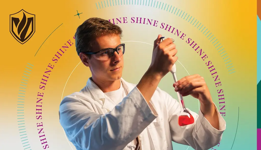
Photos capture the essence of Valpo’s stories, highlighting collaboration, exploration, celebration, and the uniqueness of the place we call home. Whether we’re shining a spotlight on our Beacons or highlighting the Chapel of the Resurrection and other campus landmarks, the best photos are authentic, candid, natural, and keep the essentials in frame. See examples and explore masking and halftone patterns in our brand guide.
Graphic Elements
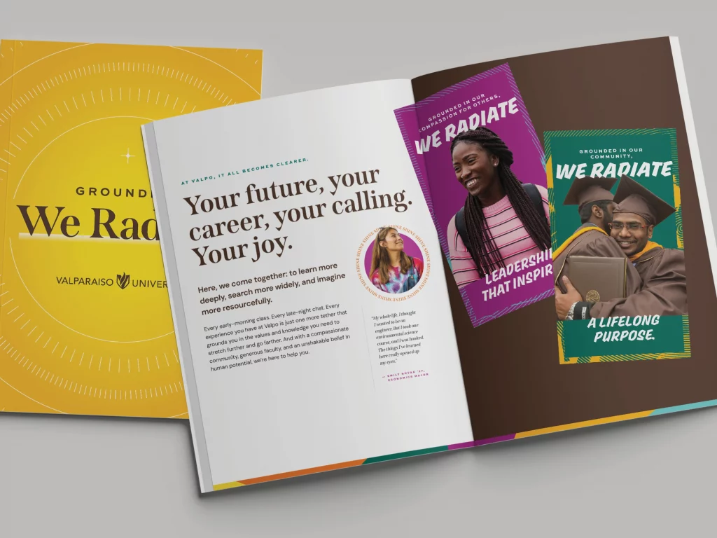
From the dynamic gradients that embody the true nuance of our radiance with iridescent colors signifying our interdisciplinary pursuits and collective call, to the circular stained-glass graphic succinctly representing our story in a single visual, to the radiating graphic that anchors our pieces and represents our outward impact on the world, each of our graphic elements serves a unique purpose and leaves a lasting impression, much like every member of our Valpo community.
Putting it all together
All the elements of our visual language work together to create the overall cohesive look of our Valpo brand. Utilized purposefully and combined strategically, these elements can create designs that speak to specific audiences and communicate specific messages, ranging from admission materials for prospective students and families to advancement materials for alumni and prospective donors.

Brand Support
Are you feeling inspired to radiate but aren’t sure where to start? Whether you’re looking for a deep dive into our new color palettes, additional brand training to write stories full of light, or help creating marketing materials within this shiny new creative platform, the Valparaiso University marketing team would love to help you spread your light. We encourage you to reach out to our brand coach at any time, or visit the contact page linked below for additional support.
Nicki Kollar ’18, director of marketing and brand management
nicki.kollar@valpo.edu
FAQ
Logos
The marketing team would be happy to create a brand new co-branded logo for your department! Please contact brand.manager@valpo.edu to request a co-branded logo.
Typography
To download Valpo’s brand fonts, visit Valpo’s data asset management (DAM), Lytho, or valpo.edu/marcom.
To install brand fonts on a Mac computer, save the .OTF or .TTF font files to your computer. These can be found on Valpo’s data asset management (DAM), Lytho, or at valpo.edu/marcom. Unzip the downloaded font by double-clicking the zipped file. Open the Applications folder and open the Font Book application. Either drag the .OTF or .TTF files to the Font Book application, or click File > Add Fonts to Current User… and select the .OTF or .TTF files.You may need to restart the application in which you want to use the font, if it is already open.
To install brand fonts on a PC, save the .OTF or .TTF font files to your computer. These can be found on Valpo’s data asset management (DAM), Lytho, or at valpo.edu/marcom. Unzip the downloaded font by double-clicking the zipped file. After it has been unzipped, open the folder with the font files. Right click on the .OTF or .TTF font file and select Install. You may need to restart the application in which you want to use the font, if it is already open.
Whenever possible, Valpo’s brand fonts should be used on any externally facing marketing materials. They can be used on the Word suite (Word, Excel, PowerPoint, etc.), the Adobe Suite (some are Adobe fonts and can be toggled on in the Creative Cloud application), and Canva (through the Valpo brand kit). We have purchased commercial licenses for our brand fonts or they are open source, meaning anybody at Valpo can use them. To download the fonts, visit Valpo’s data asset management (DAM), Lytho, or at valpo.edu/marcom.
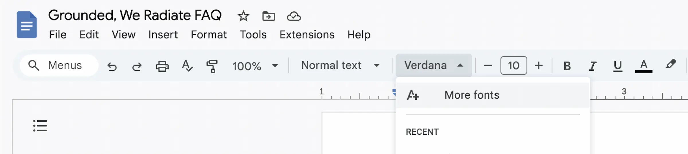
When brand fonts are not available, like in the Google ecosystem, please use Verdana to replace a sans serif font (DM Sans or Sweet Sans Pro) and Libre Baskerville to replace the serif font (Span).
Unfortunately, the Google ecosystem does not support all of our brand fonts. In place of our brand fonts, please use the following default fonts on Google Docs, Presentations, Sheets, etc.:
Span = Libre Baskerville
SWEET SANS PRO = Verdana, bold, in all capitals
DM Sans is a Google Font and can be added to your library by going to “More fonts” in a Google Doc, Presentation, Sheets, etc, searching for DM Sans in the search bar, and clicking on the result.
The Sharpie font is mainly used for athletics marketing materials, but it is a great option for more informal marketing pieces, too. The Sharpie font may be used on an invitation for high schoolers, an event flyer, or an athletics poster. The Sharpie font typically should not be used on more formal items like a letter from the President or an appeal from advancement.
Color
We proudly reign as the brown and gold and those colors should be leading our designs. If a design calls for a flood of color, we encourage you to use brown and gold with touches of secondary colors to accent our heritage color palette.
Graphic Elements
Smooth gradients, symmetrical and asymmetrical radiating lines, and stained glass elements are beautiful visual elements that help us tie our brand together. Please reach out to brand.manager@valpo.edu for working files, or feel free to play with the elements based on our visual language spectrum found in the brand guidelines.
Templates
We would be happy to add you to the Valparaiso University team to access the Canva brand kit for all of your design projects. Email brand.manager@valpo.edu for access.
Brand
We are so excited you are interested in learning more about Valpo’s brand. Please contact Nicki Kollar, director of marketing and brand management, to learn more. She can be reached by email at nicki.kollar@valpo.edu or brand.manager@valpo.edu.
We encourage all our campus partners and all of their vendors to use the new branding! Feel free to explore and share our brand guidelines and assets, found on Valpo’s data asset management (DAM), Lytho, or at valpo.edu/marcom.
Over the next year, the marketing team will work diligently to update key marketing materials across campus, with a goal of being fully integrated into the new brand by fall 2025.